

Our Favorite Prints Part TWO: Through Each Other's Eyes
We're taking a minute to celebrate each other!

Hey again, it’s Sarah!
In our last Charm Pack, we took a look at our favorite Ruby Star prints through each other’s eyes. I loved hearing what everyone chose, and it was such a beautiful reminder of how long we’ve been creating, cheering, and growing together.
This time, we’re turning things over to Kim and Melody. I am also including Alexia’s picks and full comments at the end, since I missed pasting them in last time while prepping the letter (whoops🤪). Each person shared their own favorite pieces from the rest of the crew. I love how personal their picks feel. They really capture what it’s like to admire each other’s work up close for so many years!


KIM’s picks above: Choosing my favorite print from each designer was quite the task! I am sure if you ask me tomorrow I will have different answers for you.
For Rashida Coleman-Hale, it would have to be 1000 Cranes, because birds of course. Rashida blends graphic and organic so magically. It’s no wonder this print has endured over the years and been licensed (and copied!) multiple times.
When we debuted under the Ruby Star Society banner, we did smaller collections -just four prints in three colorways each alongside a basic. Looking back on these groups recalls fond memories of creative renewal and experimental energy. Melody Miller’s collection was called Social and, shocker, my favorite print is Birds. I always love her collages of photo art, pattern, and hand-drawn elements.
I love Alexia Abegg’s whole deal with cheater prints and faux appliqué. Meadow Star was like Alexia’s version of Rumi embracing her truth at the end of KPop Demon Hunters (and its feature on the cover of American Patchwork and Quilting surely strengthened the quilting honeymoon for the next generation). So, of course, I have to pick the hero of Meadow Star, Menagerie.
For Sarah Watts, it’s got to be Snacks the Cat, aka Scaredy Cat from the group Good Spirits collection. I believe the wide-eyed kitty started out as Craftedmoon merchandise and clearly it needed to be fabric. Snacks’ various expressions are all so funny and perfectly unhinged, just like Sarah!
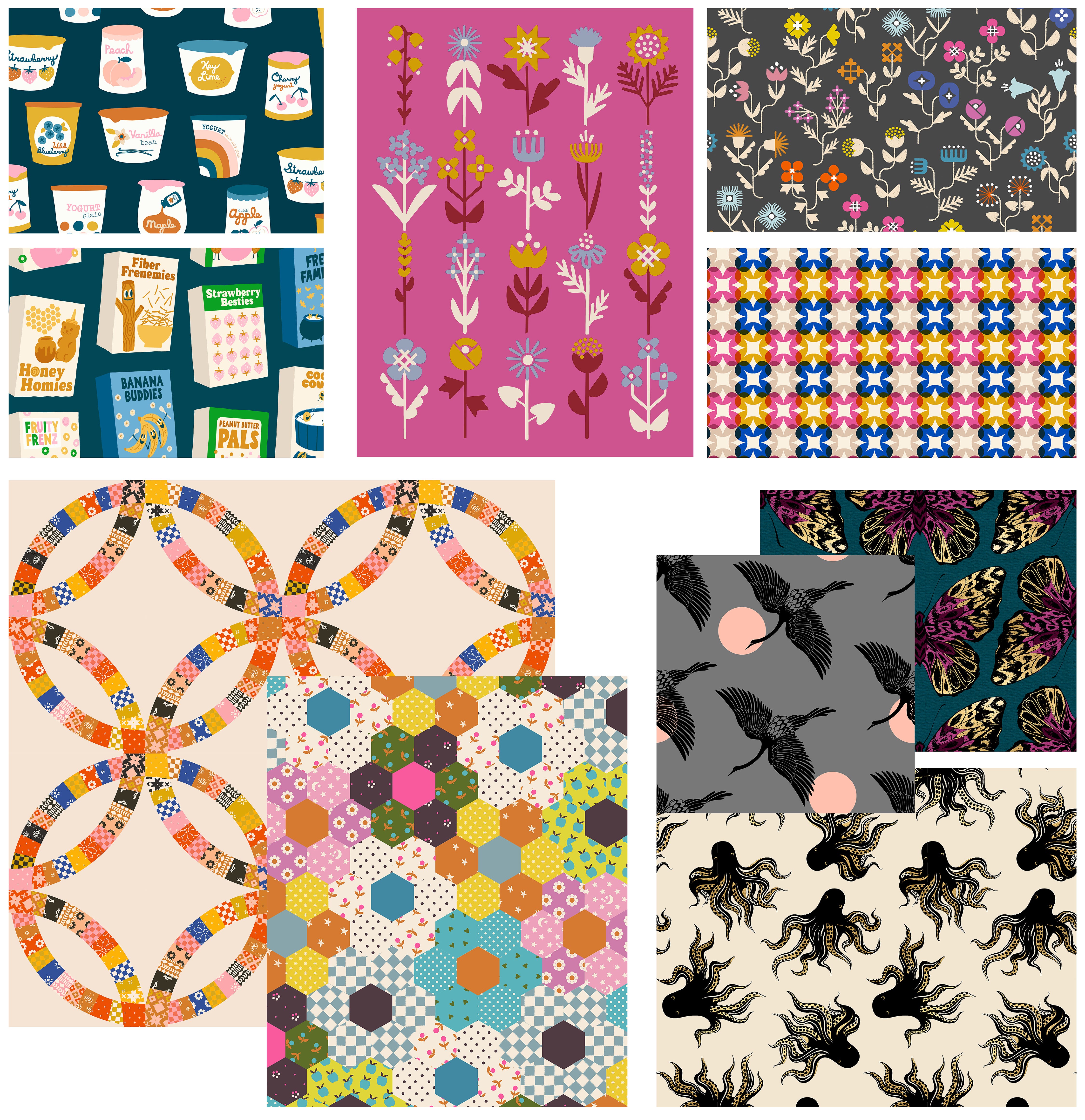
MELODY’s picks above: I’ve worked with these women for a long time now, and there have been so many moments in the last 12+ years where I have felt admiration and amazement at the art that they have submitted for production. I love my role as Creative Director where I get to deep dive into each piece of art to get it ready for our mill. As I looked back through our work for this assignment, I noticed a few trends that really stood out to me over the years.
I absolutely love packaging design, and sometimes play with it in my own artwork. It’s a little intimidating! And then out of the blue, Kim Kight will submit something like her yogurt or cereal box print where she has effortlessly created the most delightful products, complete with whimsical illustrations and perfectly imperfect type. I aspire for artwork as naturally and effortlessly quirky as Kim’s. I just can’t get over the joy of the first time I saw “Fiber Frenemies” or “Freaky Familiars” (which was so good it inspired an entire follow-up Halloween collection).
Meanwhile, Rashida has a way of approaching floral prints with something like architectural precision to create layouts that are mind-blowing in both their simplicity AND complexity. I’ve spent a lot of time drawing flowers, but Rashida puts on her hard hat and builds flower structures and flower worlds. I don’t know anyone else who could make a floral plaid like she did, where a single pretty flower builds itself into a sturdy geometric wall evoking breeze blocks, but all the while hinting right back to a cozy, familiar pattern in textiles. Genius.
I’ve loved watching Alexia’s work become more and more complex over the years; she and I share a love for getting lost in the puzzle of complicated repeats. There was a wonderful moment a few years ago when she began putting her simpler designs into complex cheater prints, and rainbows and fireworks immediately lit up the sky. From season to season, I enjoy seeing how she navigates that balance between her simple, intentionally imperfect, hand-drawn designs and precise, geometric quilty repeats. And I particularly love how the final prints feel cozy and nostalgic, yet still fresh and full of energy.
It doesn’t matter if we’re on a plane, at a dinner table, in our studio, or traveling in another city, there’s one thing I can count on: Sarah will be drawing. There doesn’t seem to be any subject matter that intimidates her or that she can’t put her own Sarah Watts spin on. In looking back, I realized some of my favorite of her designs strike an incredible balance of elegance, gothic glamour, complexity (of the drawing itself) and simplicity of color and layout. Will we ever get enough of her Mystery Food octopus design? I love how her work can be lacy and gilded and ornate, and yet still feel hand-drawn and so damn approachable and friendly (just like Sarah)!


ALEXIA’s picks above:
Top left: Rashida’s Woodland Park: This print just KILLS me. It summons all of the cute warm feelings in my heart. I loved seeing Rashida create such an intricate creative story within such a technically difficult print.
Top middle: Kim’s Gummy Bears: I love every single nostalgic thing Kim brings to her collections. And she really brings them in the best way! I love candy, like, LOVE candy, and when Kim shared this print for the first time in one of our weekly creative meetings I nearly fell out of my chair. I love their squishy little bodies so much.
Top right and bottom left: Sarah’s Cheshire Cats and Zombie Print: One of the first things Sarah and I connected about after meeting was our love for Halloween. I always love Sarah’s spookier work but this print just makes me so happy. When Sarah embarked on her Alice collection I watched in awe as she created each character in her own unique style. Sarah and I share an admiration and love for Mary Blair, the artist that created the aesthetic of many early Disney films.
Bottom right: Melody’s Hello Sunshine: I love this panel style print and the way it strikes a very nostalgic chord. Watching Melody create this beautiful and technically difficult print was so exciting. She added new details each week as she finished the print. And they all combined to create the perfect print for the bedroom I dreamed of as a girl in the 80’s but so much cooler!
It’s Sarah again, and that’s all for now! Seeing these pieces through each other’s eyes continues to remind me how special this group really is. We’ve grown together for over a decade, each bringing something new to the table every time, and there’s always more to celebrate.
Thanks for following along with this two-part edition of the Charm Pack. I hope it’s given you a peek into how much love, laughter, and mutual respect are behind the work we make.
xo,
